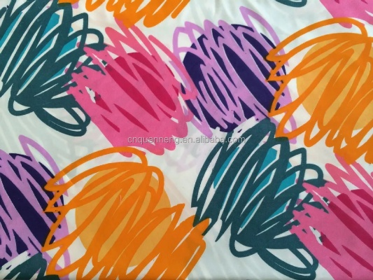
The Art of Textile Patterns and Color Coordination
"The Art of Textile Patterns and Color Coordination: A Comprehensive Guide",This comprehensive guide delves into the art of textile patterns and color coordination, providing a thorough understanding of the various techniques and principles involved in creating beautiful, visually appealing designs. The guide covers topics such as pattern design, color theory, and color matching, offering practical examples and exercises to help readers develop their skills.,One of the key features of this guide is its emphasis on practical applications of textile design. It includes case studies that demonstrate how different patterns and colors can be used to create unique and eye-catching garments, accessories, and home decor items. Additionally, the guide provides tips for selecting appropriate colors and patterns based on personal preferences and cultural context, as well as strategies for achieving balance and harmony in multicolored designs.,Overall, "The Art of Textile Patterns and Color Coordination" is an essential resource for anyone interested in learning more about the creative process behind textile design. With its clear explanations, practical examples, and engaging writing style, this guide is sure to inspire readers to pursue their own passion for textile art.

In the realm of textile design, pattern and color are two elements that together create an overall aesthetic appeal. They not only reflect a designer's vision but also convey specific messages and emotions. This article explores the intricacies of pattern and color coordination in textiles, using examples from various cultures and time periods to illustrate the beauty and significance of these design elements.
Patterns on textiles can be categorized into several types, including geometric, floral, abstract, and traditional motifs. Each type has its own unique characteristics and is used to convey different meanings. For example, geometric patterns often represent order and symmetry, while floral patterns symbolize life and growth. Abstract patterns can evoke feelings of freedom and creativity, while traditional motifs carry cultural heritage and historical significance.
Color coordination in textiles involves selecting colors that complement each other and create harmonious visual effects. The use of color theory, such as the color wheel and color harmony, can help designers achieve this goal. For instance, warm colors like red, orange, and yellow tend to make people feel energized and happy, while cool colors like blue, green, and purple create a calming effect.
To demonstrate the importance of pattern and color coordination in textile design, let us examine some examples from around the world. In ancient Egypt, textiles were often adorned with intricate geometric patterns and vibrant colors to represent the gods and goddesses. In Islamic art, geometric patterns were commonly used to decorate textiles, while bright colors were reserved for clothing and accessories.
Modern textile design incorporates a wide range of patterns and colors, reflecting the diverse cultures and lifestyles of modern society. For example, African textiles often feature bold geometric patterns and vibrant colors to celebrate their rich history and culture. In Western fashion, patterns like stripes and polka dots are popular choices, while colors like blue and white are associated with sophistication and elegance.
One of the most famous textile patterns in history is the Japanese kimono, which features delicately woven patterns and muted colors. The kimono was worn by samurai warriors during Japan's feudal period, symbolizing their status and honor. Today, kimonos are still popular in Japan and other Asian countries, where they serve as a reminder of their cultural heritage.
In the West, the embroidered lace on a wedding dress is a classic example of pattern and color coordination. The intricate designs and vibrant colors create a stunning visual effect that reflects the bride's personality and style. Similarly, the use of color in fashion is becoming increasingly important, with designers striving to create garments that stand out in a crowded market.
In conclusion, pattern and color are essential elements in textile design that contribute to the overall aesthetic appeal of a piece. By understanding the different types of patterns and exploring the principles of color theory, designers can create textiles that not only look beautiful but also convey specific messages and emotions. Whether it's ancient Egyptian textiles or modern Western fashion, pattern and color play a crucial role in shaping our perception of textiles and their cultural significance.
纺织品图案纹样配色概述
纺织品图案纹样配色是艺术与工艺的结合,它不仅体现了设计师的创意,还反映了纺织品的品质和工艺水平,在配色过程中,我们需要注意色彩的搭配、协调性以及视觉效果。

纺织品图案纹样配色原则
- 色彩对比与平衡:通过对比强烈的色彩和柔和协调的色彩搭配,创造出丰富的视觉效果。
- 季节与场合匹配:根据不同的季节和场合,选择与之相匹配的配色方案。
- 功能性需求:考虑纺织品的功能性需求,选择符合其用途的配色方案。
案例分析
时尚印花图案纹样配色
某品牌的新款时尚印花面料,采用了鲜艳的红色和蓝色作为主要配色,红色与蓝色的搭配,既展现了时尚感,又体现了高贵与优雅,这种配色方案在夏季服装中非常受欢迎,能够吸引消费者的目光。
时尚印花面料配色示例
| 颜色组分 | 红色 | 蓝色 | 对比度 | 用途 |
|---|---|---|---|---|
| 主要配色 | 鲜艳红色 | 清新蓝色 | 高对比度 | 夏季服装 |
复古波点图案纹样配色
某品牌的一款复古波点图案面料,采用了深蓝和浅紫作为主要配色,深蓝与浅紫的搭配,既有复古感,又不失时尚感,这种配色方案适合在秋冬季节穿着,能够给人一种温暖而又不失优雅的感觉。
复古波点面料配色示例
| 颜色组分 | 深蓝 | 浅紫 | 对比度 | 用途 |
|---|---|---|---|---|
| 主要配色 | 暗沉蓝色 | 明亮紫色 | 中等对比度 | 秋冬服装 |
纺织品图案纹样配色技巧
- 选择合适的颜色搭配:根据纺织品的功能性需求和设计风格,选择合适的颜色搭配,对于夏季服装,可以选择鲜艳的颜色以吸引消费者的目光;对于秋冬服装,可以选择柔和的颜色以营造温暖的感觉。
- 注意色彩的层次感和过渡:在配色过程中,要注意色彩的层次感和过渡,使整个图案更加生动、有层次感,可以通过使用渐变色、过渡色等手法来实现。
- 注意色彩的搭配比例:在配色过程中,要注意色彩的搭配比例,避免出现过于拥挤或过于平淡的情况,可以通过调整色彩的比例、使用对比度等手法来实现。
纺织品图案纹样配色是艺术与工艺的结合,它需要遵循一定的原则和技巧,在选择配色方案时,需要根据纺织品的功能性需求、设计风格、季节和场合等因素进行综合考虑,还需要注意色彩的层次感和过渡、搭配比例等因素,使整个图案更加生动、有视觉效果,在实际操作中,可以根据具体情况进行灵活运用。
Articles related to the knowledge points of this article:
The Fabric of Innovation:A Look at Zeroths Exquisite Textiles
Embracing Innovation:The Journey of Shaoxing Jingsi Textiles
The Ugandan Textile Market A Global Perspective and Regional Insights
Exploring the Global Market with Wuxi Fengyi Textiles


![The Art of Softness in Fashion:An Insight into 宸之漫纺织品]](https://www.i505i.cn/zb_users/upload/2025/09/20250917090724175807124467058.png)